Branding · Web Design · Development
Kingshavers
A grooming brand with a cinematic edge
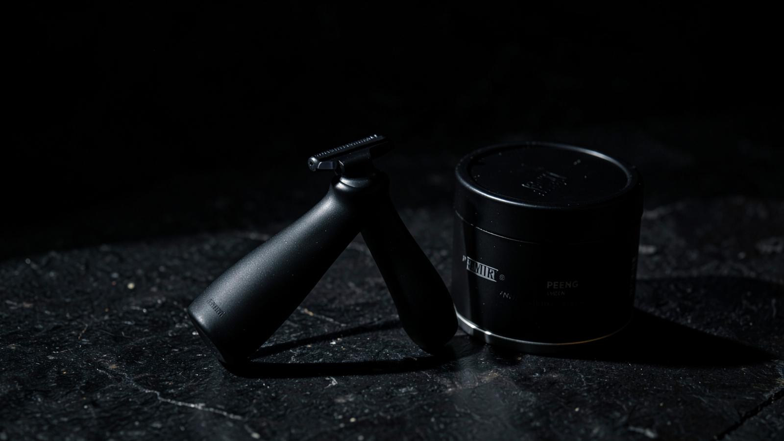
Kingshavers sold a premium product through a website that looked like a marketplace listing. We rebuilt the brand from the identity out — dark, tactile and confident — and shipped a site that finally matched the product in the hand.
- Client
- Kingshavers
- Role
- Brand & product design, front-end development
- Timeline
- 10 weeks · 2025
- Services
- Brand identity, Art direction, Web design, Development
- Stack
- Next.js, Sanity CMS, Tailwind CSS, Vercel
The challenge
Strong products, weak perception. The old site leaned on stock photography and discount banners, which made a premium range read as commodity. Conversion depended on price rather than desire.
Approach
- 01
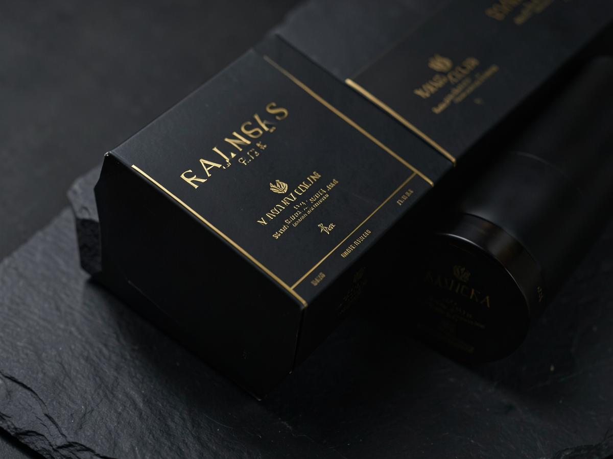
Rebuilt the identity around a dark, tactile palette and a single expressive display face.
- 02
Art-directed product photography so every hero shot carries the material quality.
- 03
Restructured the funnel: one clear promise per screen, one action per screen.
- 04
Moved all content into Sanity so the team can publish campaigns without a developer.
Outcome
The new site launched with a coherent brand story from first scroll to checkout. Inbound leads tripled within a quarter and average order value rose as customers stopped shopping on discount.
3×
Inbound leads
+41%
Average order value
0.9s
Largest contentful paint